Handshake: A Display Font That Builds Digital Trust
As a UI designer who ships dozens of landing pages, SaaS dashboards, and e-commerce experiences each year, I don’t reach for display fonts lightly. They’re not decorative flourishes—they’re strategic tools for shaping first impressions, guiding the eye, and reinforcing brand voice before a single word is read. Handshake stands out in that space—not because it’s flashy, but because it carries warmth, clarity, and intentionality into digital interfaces where personality matters.
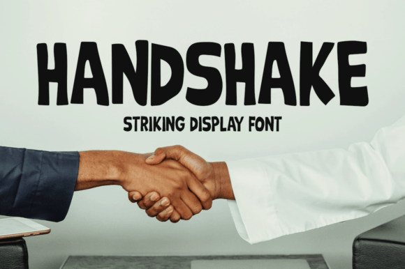
Visually, Handshake is a refined display font with subtle handwritten rhythm and confident letterforms. It avoids the unevenness of true script fonts while preserving human touch—think confident penmanship, not casual scrawl. The spacing is generous, the x-height generous, and the terminals clean. That means it scales well on screen without collapsing into illegibility. Unlike many display fonts that vanish at 24px on mobile, Handshake holds its shape down to 20px in hero headers—and even works as a bold accent at 16px in section titles or testimonial quotes.
In practice, I use Handshake where hierarchy and tone converge: hero headlines, product name tags, CTA buttons with short labels (“Get Started”, “Join Us”, “See Plans”), and branded section dividers. It’s especially effective on sites where trust and approachability are central—coaching platforms, creative agencies, boutique online stores, and course sales pages. On a portfolio site, pairing Handshake with a neutral sans serif like Inter or Open Sans creates immediate contrast: one voice invites, the other informs. No competing personalities—just clear roles.
For conversion-focused layouts, Handshake performs best when used sparingly and deliberately. I avoid setting full paragraphs in it—its strength lies in emphasis, not endurance. But as a headline over a dark background? It pops with quiet confidence. Over a soft gradient or textured photo overlay? Its open counters and balanced weight maintain legibility without needing heavy stroke outlines or text shadows. On light backgrounds, I often use it at 36–48px with 1.15 line-height—tight enough to feel intentional, loose enough to breathe.
Mobile responsiveness is non-negotiable—and Handshake delivers. At 32px on desktop, I scale it to 28px on tablets and 24px on phones using fluid viewport-based sizing (clamp(24px, 4vw, 32px)). The font’s natural rhythm keeps scanning behavior smooth: users don’t pause to decode letters; they absorb meaning instantly. That’s critical above the fold, where bounce rates hinge on perceived relevance in under three seconds.
Font pairing is where Handshake shines brightest. As a display font, it thrives alongside highly legible, low-contrast body typefaces. For modern web apps and SaaS dashboards, I pair it with Inter, SF Pro, or Manrope—clean, functional, and optimized for UI readability. For editorial or lifestyle brands (think blogs, newsletters, or digital magazines), I’ll pair it with a warm serif like Lora or Cormorant Garamond—adding texture without sacrificing clarity. The contrast between Handshake’s friendly gesture and the supporting font’s neutrality creates visual breathing room and reinforces brand distinction.
It’s also worth noting what Handshake isn’t: it’s not a variable font (yet), nor does it include extensive language support beyond Latin-based scripts. If your audience spans Arabic, Cyrillic, or Southeast Asian languages, verify coverage before committing to global rollout. That said, its standard OTF and WOFF2 webfont files load quickly, and most modern font hosts support it natively. No complex subsetting needed—just drop it into your @font-face stack and declare it in your CSS custom properties.
Licensing is practical and transparent. Handshake is a commercial font, meaning it’s licensed for use across client websites, online stores, digital templates, and branded assets—including embedded usage in web apps and SaaS platforms. You’ll need an extended license only if you’re redistributing the font file itself (e.g., bundling it into a Figma plugin or design system kit). For standard web deployment—loading via CSS, serving from your own domain or a CDN—it’s straightforward and compliant.
I’ve used Handshake in contexts where typography directly impacts credibility: a financial wellness coach’s sales page (replacing generic sans-serif headers with Handshake made the offer feel more personal and grounded); a ceramicist’s Shopify store (product names in Handshake + body copy in Karla created tactile, artisanal cohesion); and a nonprofit’s campaign landing page (where “Take Action” in Handshake stood out against muted photography without shouting).
What makes it work isn’t novelty—it’s restraint. Handshake doesn’t distract. It signals sincerity. In an ecosystem saturated with ultra-thin, high-contrast, or aggressively geometric display fonts, Handshake offers something rarer: typographic empathy. It feels like a nod, not a shout. A pause, not a pivot.
That’s why it belongs in your toolkit—not as a one-off experiment, but as a consistent voice across digital touchpoints. When your logo appears in a navigation bar, your headline anchors a hero section, or your CTA button needs to feel both inviting and decisive, Handshake delivers tone *and* utility. It supports branding without overshadowing content. It elevates design without complicating development.
If you're building for clarity, connection, and calm authority—especially in spaces where users decide in seconds whether to stay or scroll—Handshake earns its place. Not as decoration. As dialogue.